Crafting a platform that simplifies influencer-brand collaborations through intuitive workflows, actionable insights, and streamlined feedback systems.
UX Design, Visual Design, Strategy
Me (Design),
Karnam (Frontend Dev),
Rahul (Strategy),
Bhawana (Backend Dev)
March 2024 - Nov 2024
The world of marketing has shifted dramatically. Traditional advertising methods no longer resonate with modern audiences, who skip ads in favor of authentic, engaging content. Brands struggle to connect with their target audience, while influencers seek ways to monetize their passion authentically. Ryme was born to bridge this gap by creating a platform where brands and influencers could collaborate seamlessly.
Our design process began with in-depth research to understand user pain points.
Fragmented Campaign Management: Brands were juggling multiple tools to onboard influencers, review content, and measure outcomes.
Unclear Influencer Fit: Aligning with the right influencers required manual efforts and guesswork.
Difficulty Measuring ROI: Metrics for campaign success were often generic and lacked actionable insights
Tedious Onboarding: Influencers struggled to set up their profiles and showcase their niche.
Opaque Campaign Requirements: Campaign details were often unclear, leading to revisions and delays.
Inefficient Feedback Loops: The back-and-forth approval process lacked transparencysure outcomes.
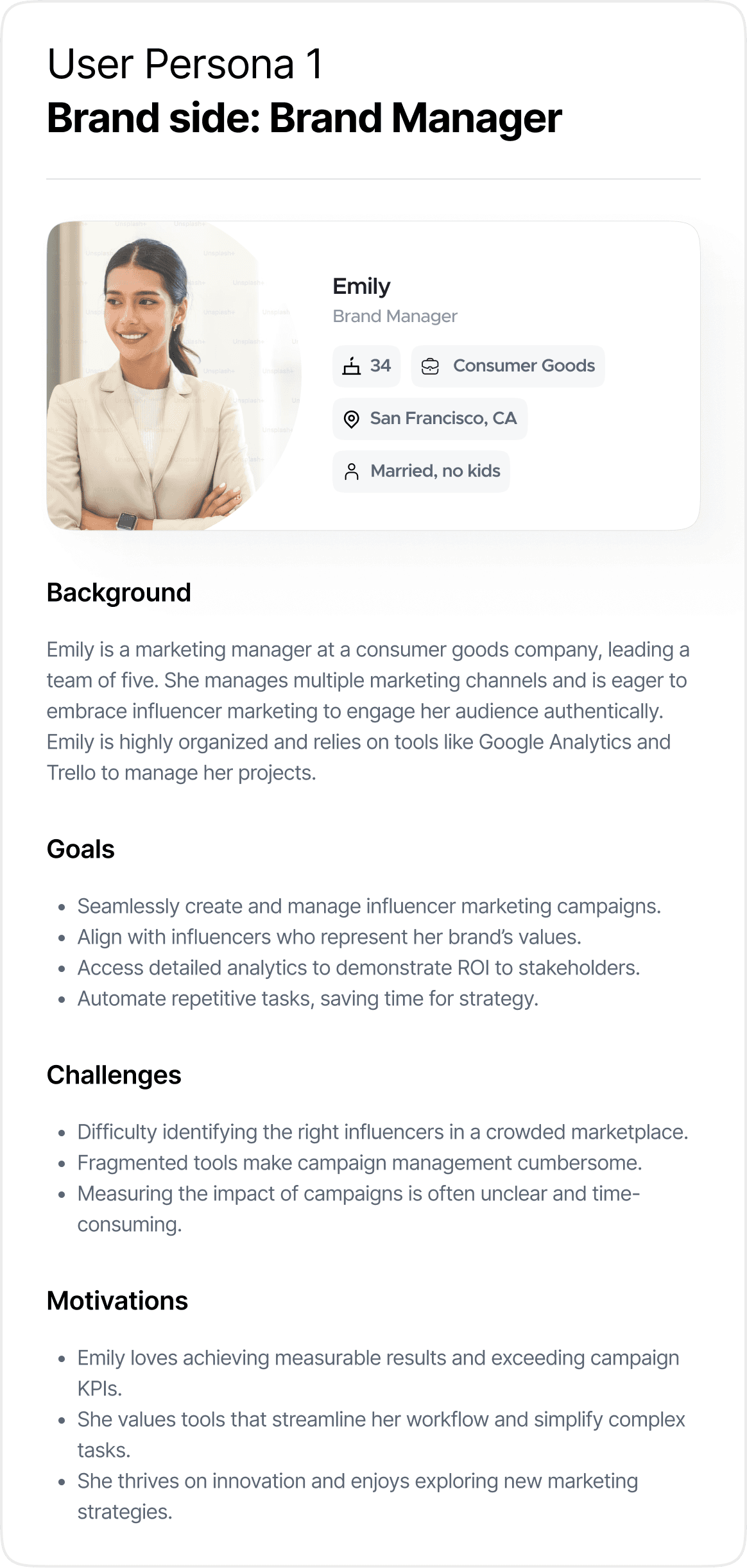
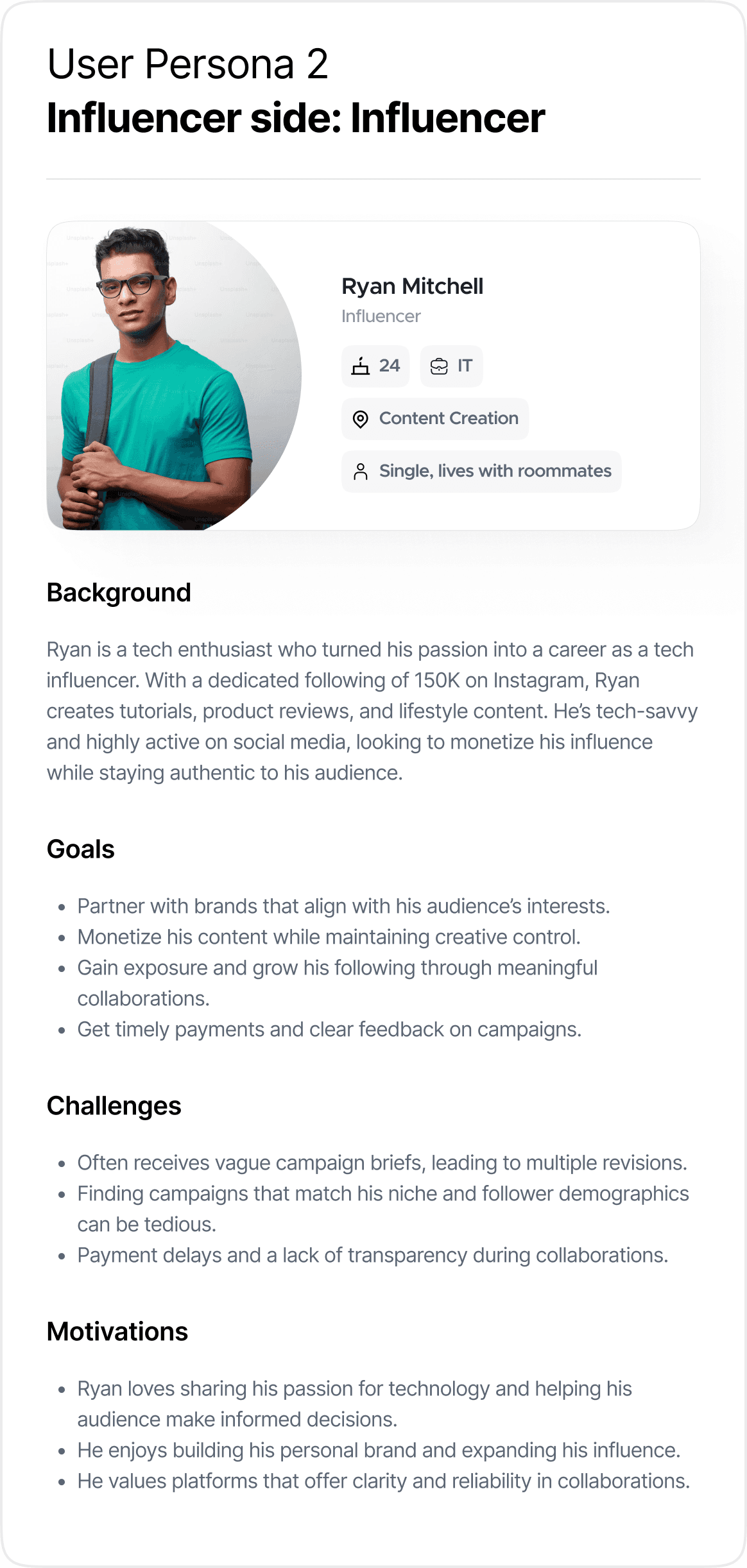
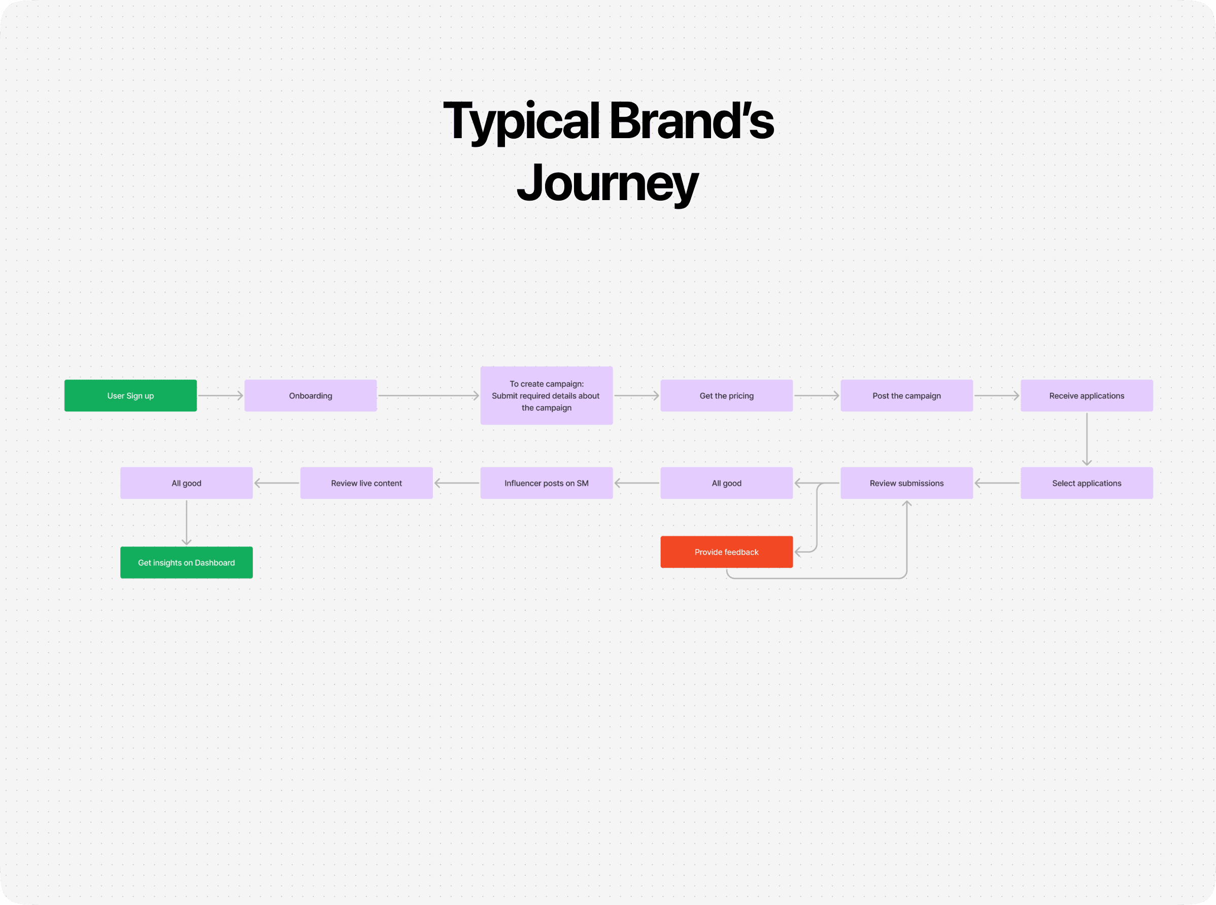
We came up with two personas for the brand side and the influencer side in order to better understand our users.
For the MVP, we focused on delivering the foundational requirements necessary for seamless collaboration between brands and influencers. These features were designed to establish a baseline experience that ensures both parties can work together effortlessly:
Fast paced building
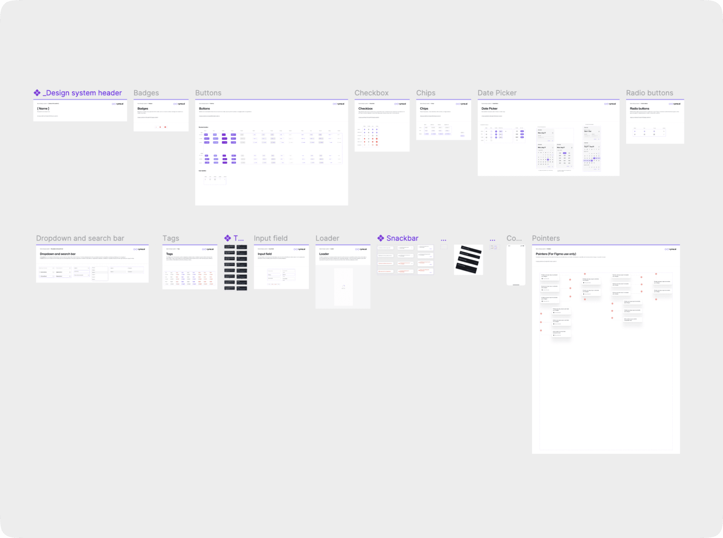
We did not have the luxury of time as we had to ship an MVP that is ready to get us some business out of the market, I immediately started building a design system to ensure consistency in our designs for the future (I always begin with a design system 😉). Since the developer wasn't going to build from scratch, I relied on Google's Material UI (MUI) as the foundation. After a few days, I created our own design system based on MUI.
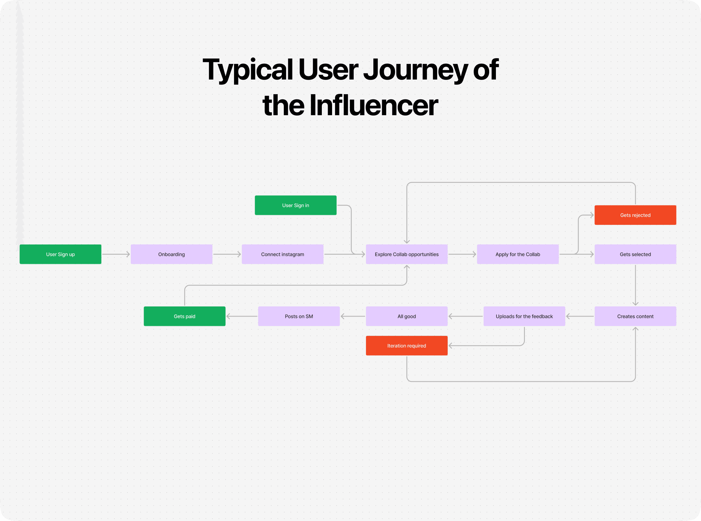
We began with mobile-first designs for influencers. The goal was to ensure influencers could easily log in, explore, and apply for opportunities posted by brands. Below is a snapshot of the user journey we crafted for influencers:

Efficient Communication: Creating a system where brands could easily review applications and provide actionable feedback to influencers.
Transparency: Allowing influencers to track the status of their applications (e.g., "Under Review," "Approved," "Needs Revision") in real-time.
Streamlined Interaction: Designing a collaborative workspace where drafts, comments, and final approvals could flow smoothly between both parties.
Reducing Delays: Implementing notifications and reminders to keep the process moving without bottlenecks.
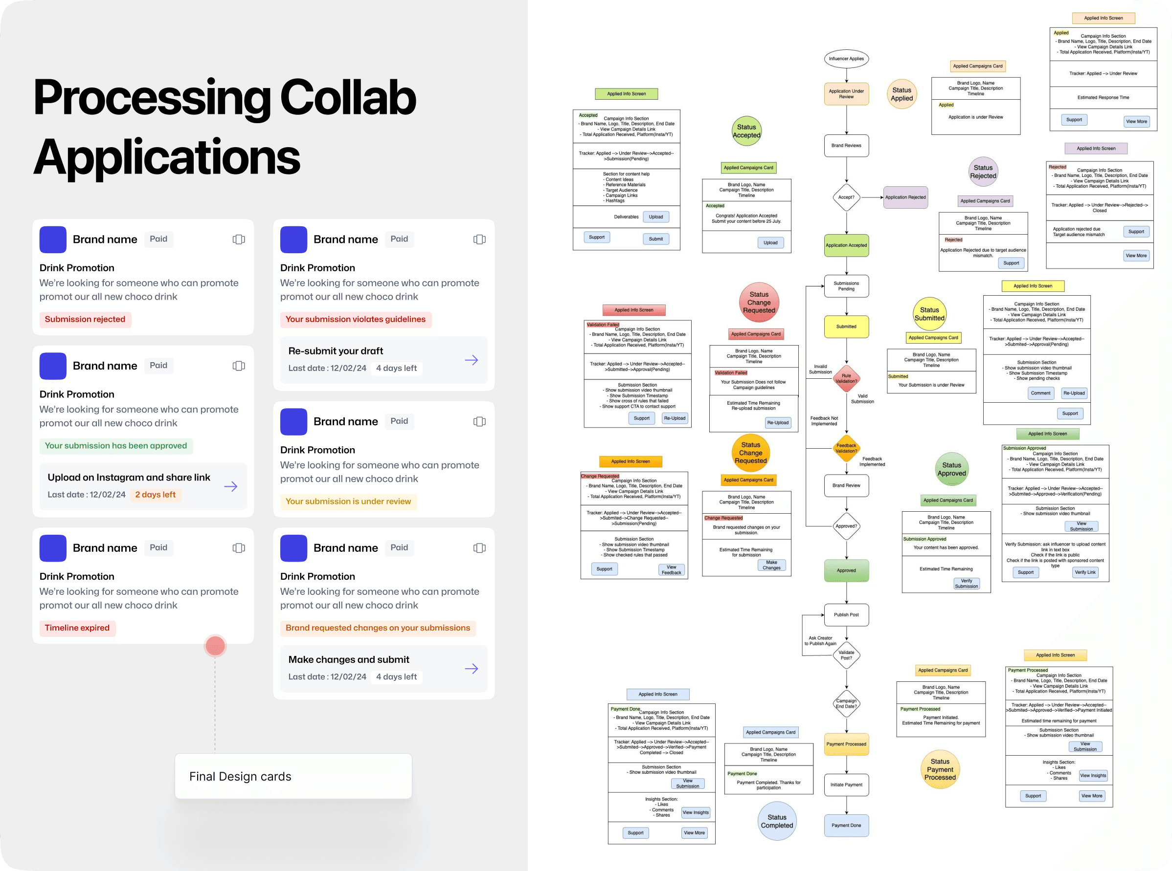
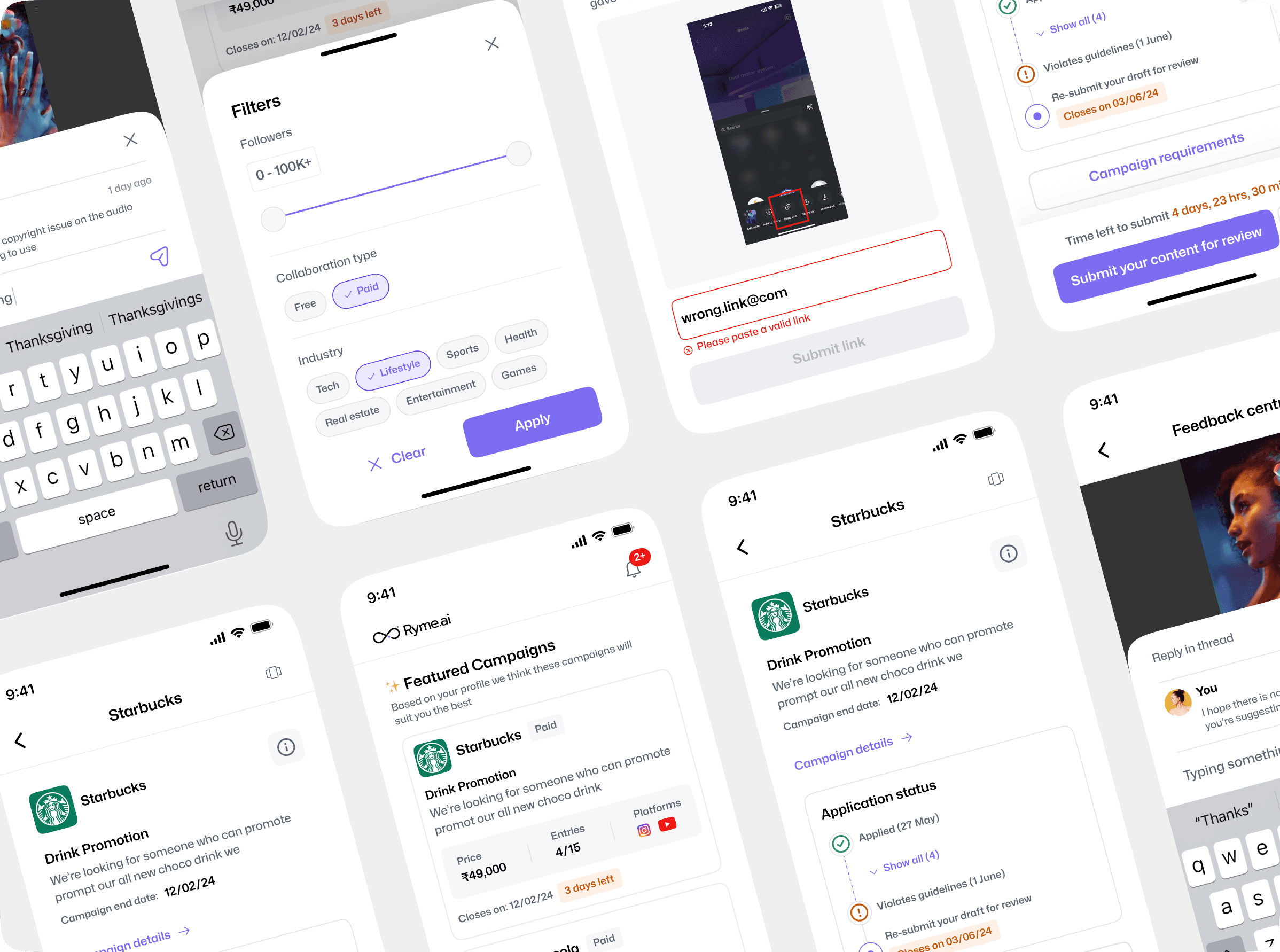
We began with mobile-first designs for influencers. The goal was to ensure influencers could easily log in, explore, and apply for opportunities posted by brands. Below is a snapshot of the user journey we crafted for influencers:
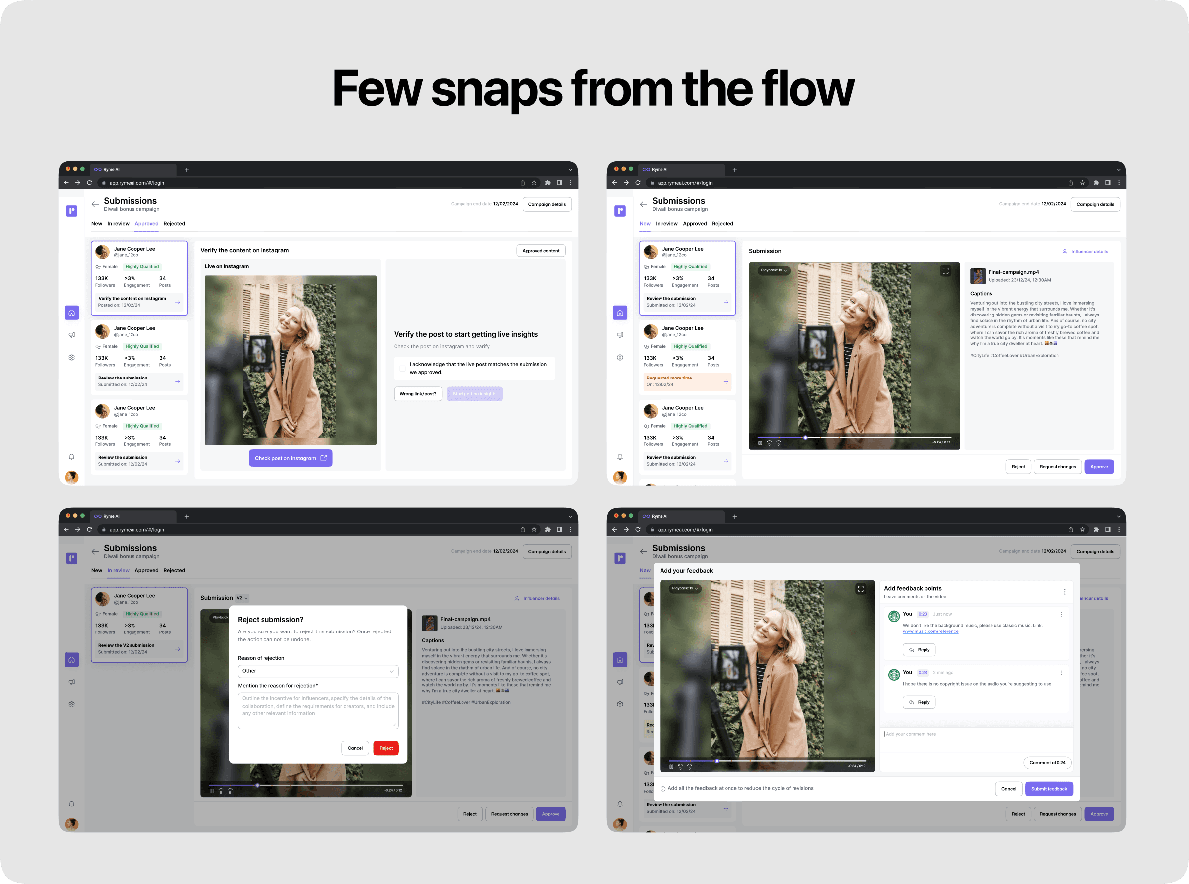
Submission Review Screen: Brands could review influencer submissions using a comment-based system, similar to tools like Loom, ensuring clarity in feedback.
Change Requests: Brands could request revisions, and influencers could resubmit their content while tracking unresolved comments.
Approval and Post Verification: Once content was approved, influencers would post on their social media, and brands would verify the live post for accuracy and visibility.
Iteration Handling: If multiple iterations failed to meet quality standards, brands had the option to reject the submission with valid reasoning
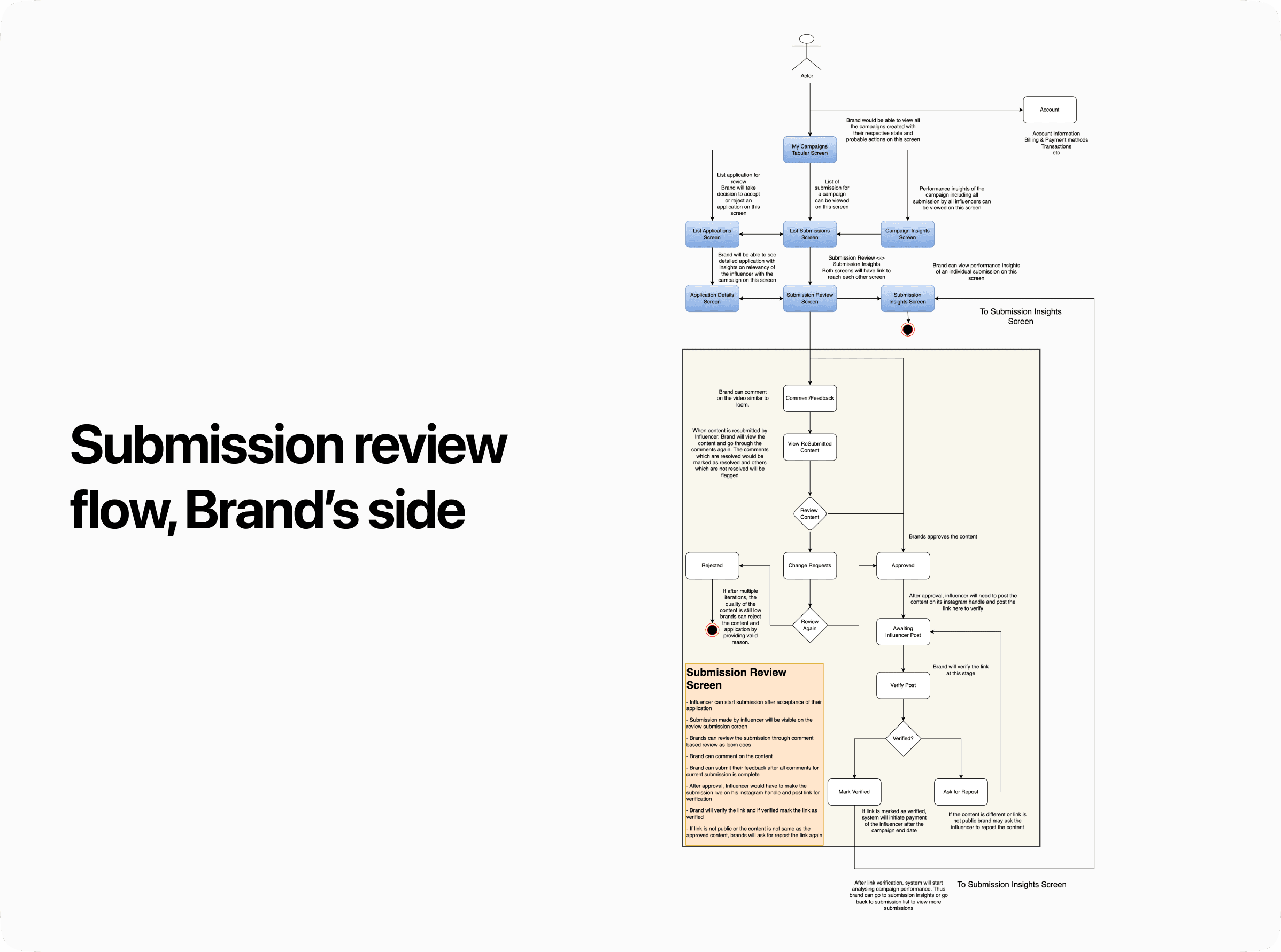
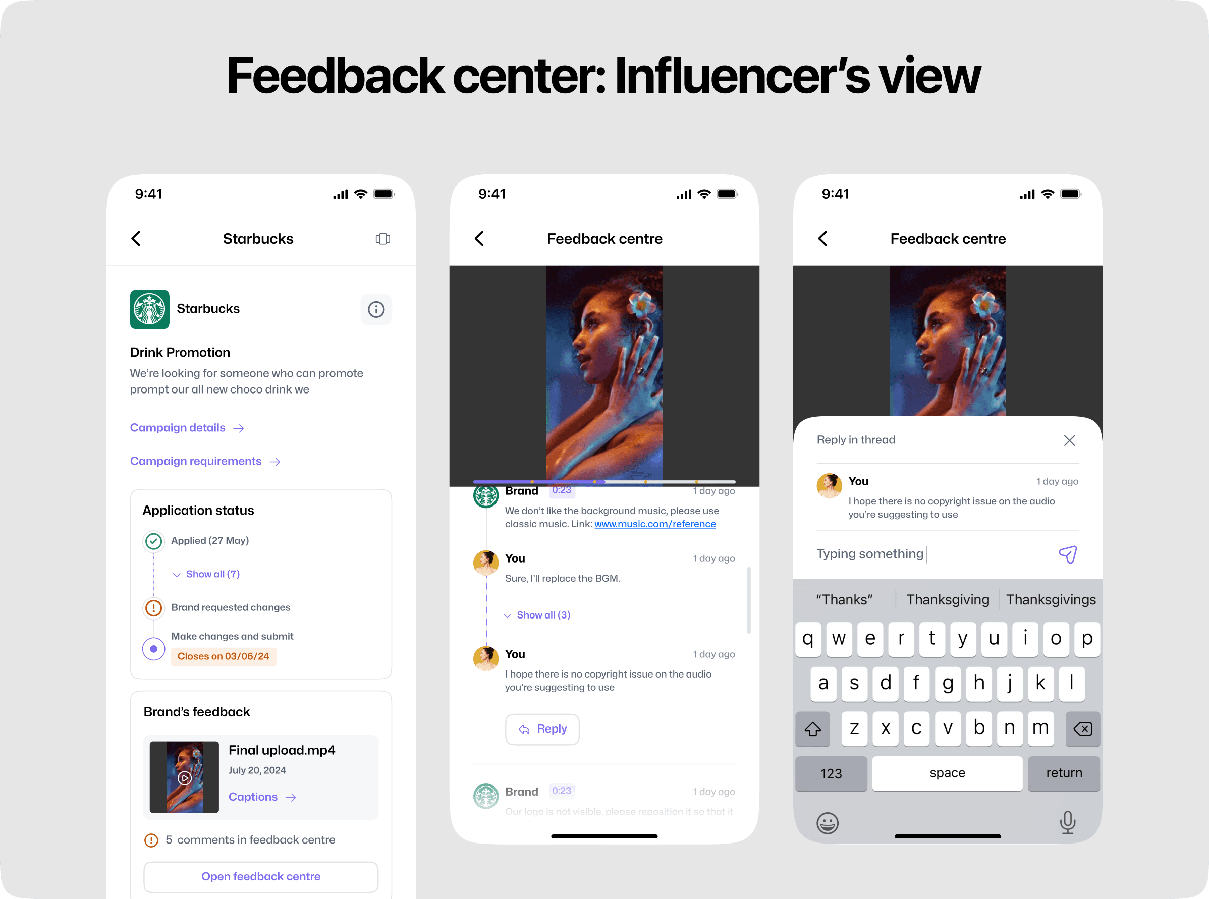
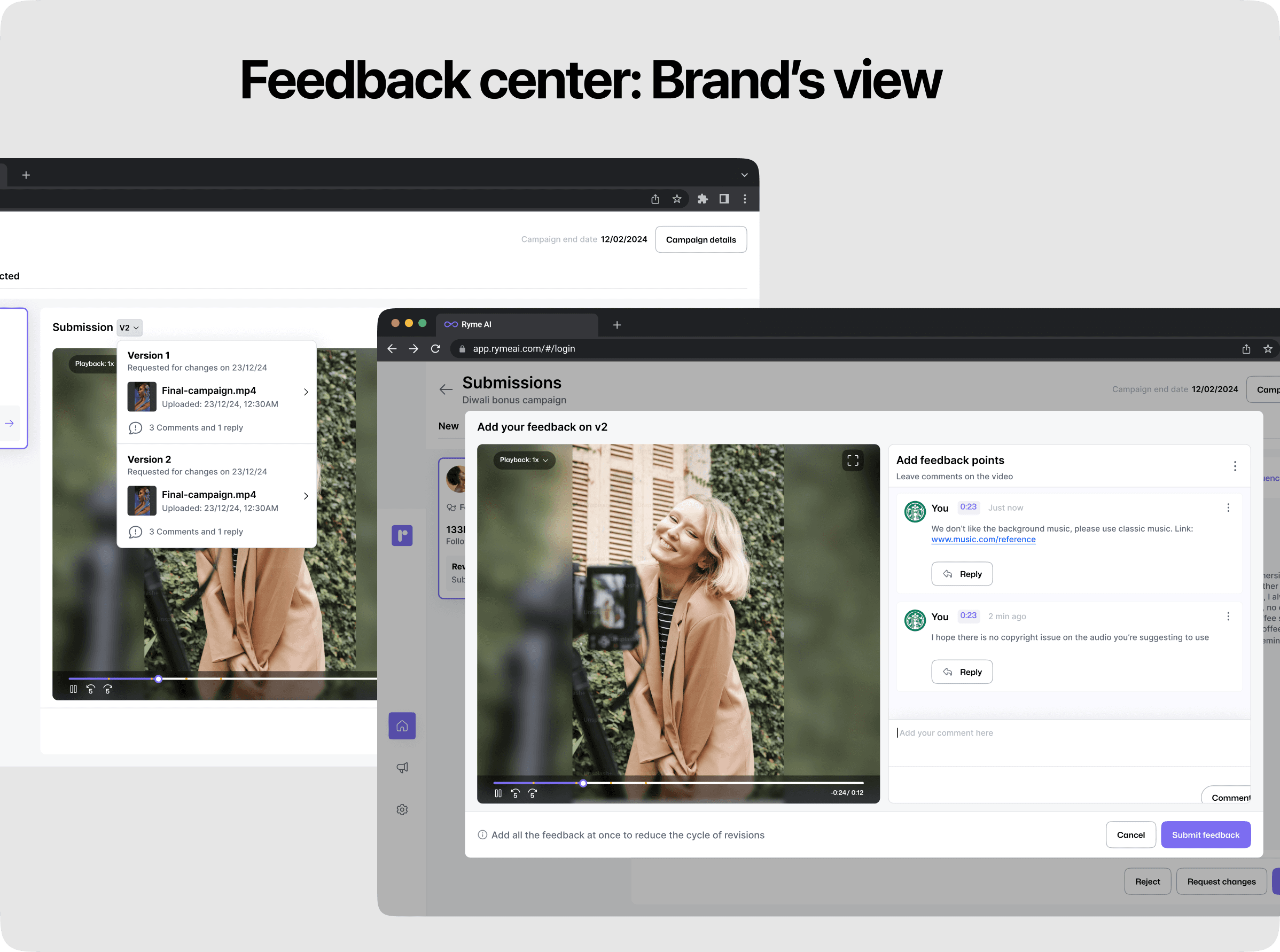
The Feedback Center acts as a structured hub where:
Brands can review influencer submissions, provide detailed comments, and request revisions.
Influencers can view feedback, make adjustments, and resubmit their work efficiently.
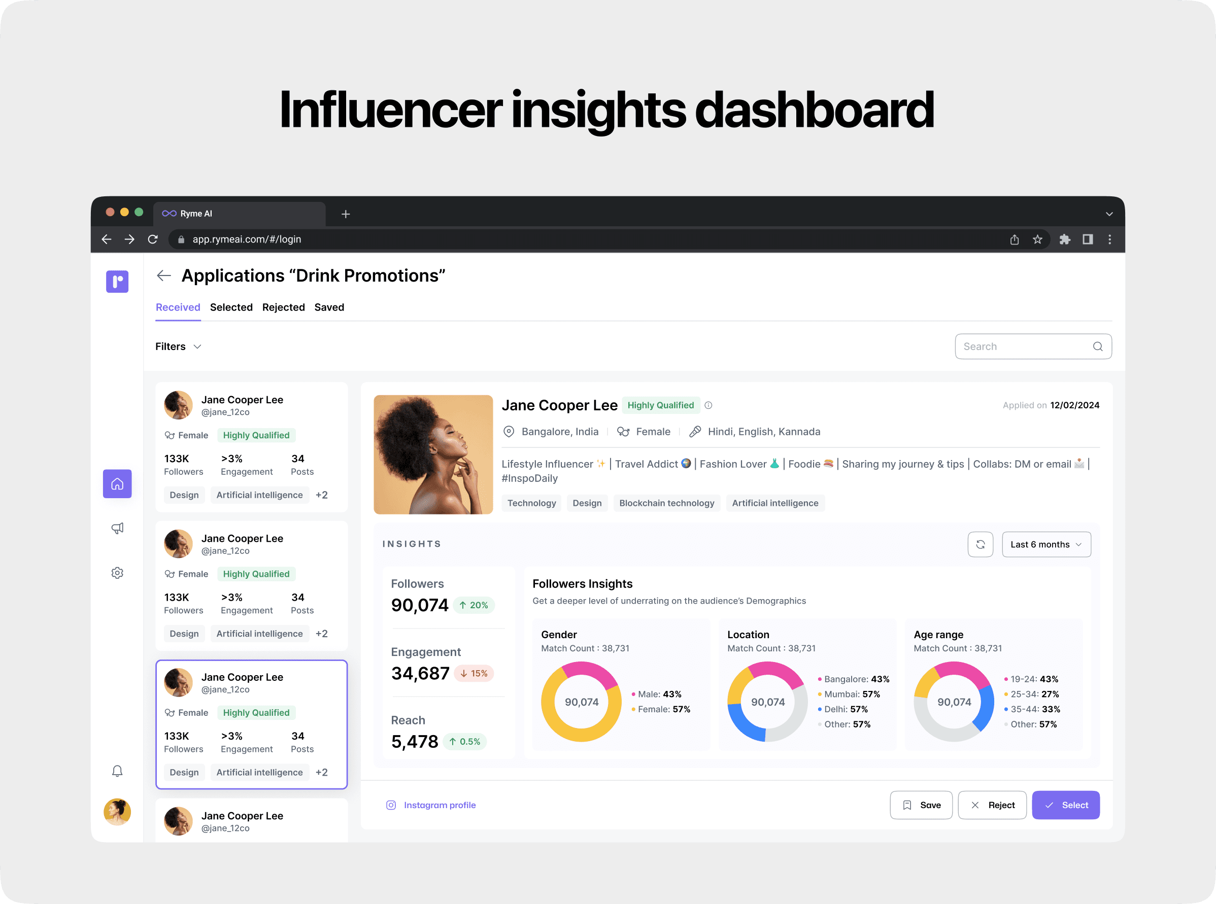
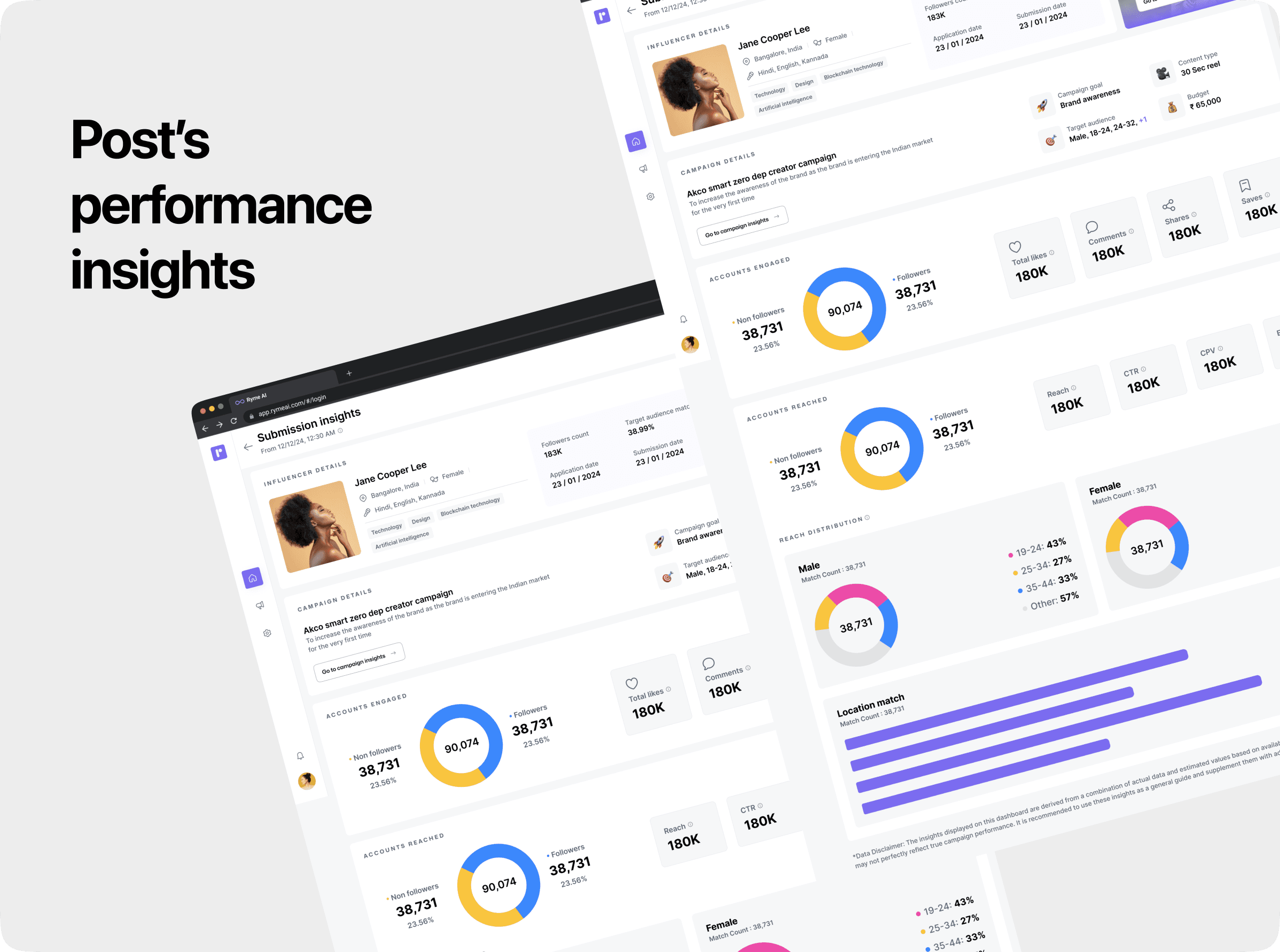
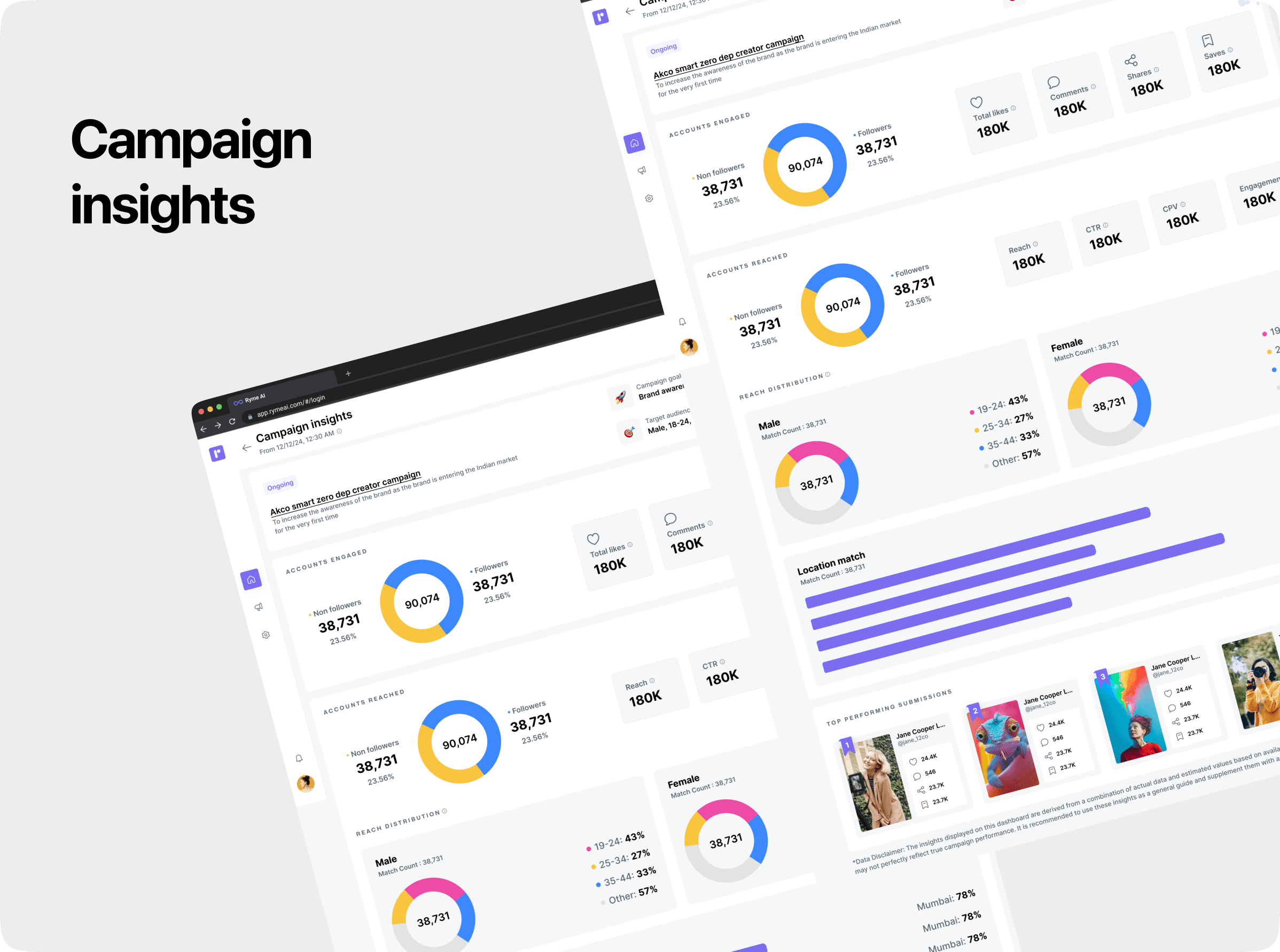
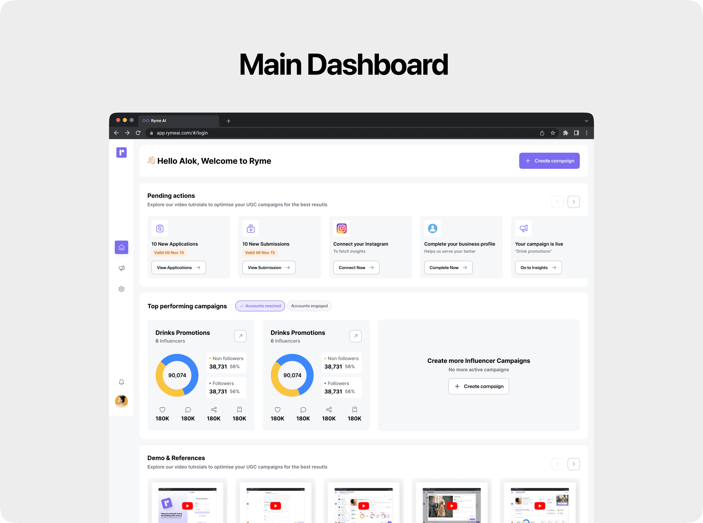
For the dashboards, our primary goal was to efficiently present all necessary insights while minimizing user effort. We aimed to ensure that users could access critical data at a glance without navigating through multiple clicks or layers. Key considerations included:
Clear Visual Hierarchy: Organizing information such as campaign performance metrics, submission insights, and influencer insights in an intuitive layout.
Action-Oriented Design: Placing actionable items (e.g., reviewing submissions, approving posts) directly on the dashboard to streamline workflows.
Data Density with Clarity: Balancing the inclusion of detailed analytics and summaries while avoiding information overload.
Quick Access: Incorporating shortcuts and filters to allow users to drill down into specifics without leaving the main dashboard.
The result was a user-friendly interface that prioritized simplicity, reducing friction and empowering users to make data-driven decisions efficiently.